Individually we humans are intelligent, emotional, illogical, unpredictable and incredibly complicated. However, our behaviour as a group is in fact far more simple. In my previous post I used a simple mathematical model to illustrate that in biological systems when there is more food available animals breed more and infant survival rates increase. In this respect humans are no different to any other form of life. Below I will outline the key factors leading to human population growth and the associated increases in global energy consumption and atmospheric carbon dioxide concentration. Note in this blog post I have generated the following plots from raw data, so no numerical models were required. References to the raw data can be found at the end of this post.
The population of the world did not reach 1 billion people until the 1800s. Prior to this point food was produced by manual farming methods. The discovery of fossil fuels was the driver for the incredible population growth to follow. The industrial revolution was between 1760-1840. During this time machines were developed to improve the efficiency of crop planting and harvesting methods, that was previously done by hand. This coupled with the development of enhanced fertilisers enabled global food production to increase significantly. The increased availability of food meant that population centres that were previously in famine were able to adequately feed their people. Consistent with typical biological systems, as more food became available the population increased. In fact for the entire human history prior to the 1800s the population was 1 billion people, and it then doubled to 2 billion in less than 150 years. This global population data was downloaded from reference [1].

The end of the second world war in 1945 marked the beginning of a second major population increase associated with the baby boomer generation. This population increase was perhaps more due to people feeling better about bringing a new child into a perceived safer world. The population doubled again this time in less than 40 years. It could be argued that increased breeding rates in perceived safer environments is also a biological trait. The following images are further illustrations of the population growth during this period. The following two images are visualisations of the population of the cities of the world in 1950 and 2010 respectively, with the size of each yellow circle is proportional to the population. Comparing these images highlights the population growth and arrival of new cities over this period. The city based population data was obtained from reference [2].
Population of the cities of the world in 1950

Population of the cities of the world in 2010

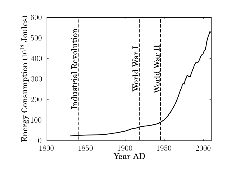
Total global energy consumption is given by the amount of energy used per person multiplied by the total number of people. The increase in total global energy consumption illustrated below, largely follows the increase in population growth. The population increase over the passed century has been mainly in the developing world countries. However, living standards and hence energy used per person have in fact been significantly increasing in the developed world countries. These two effects can be more clearly illustrated by decomposing the energy usage to that associated with developed and developing world countries. This will be the subject of future posts. The energy data presented below was downloaded from reference [3].
The vast majority of the energy consumed has come from the burning of fossil fuels. The global carbon dioxide (CO2) concentration in the atmosphere in parts per million (ppm) is illustrated below, which increases in line with the energy consumption and human population growth. The CO2 data presented below has been obtained from sources [4] to [7] listed at the end of this post.

The attribution of the carbon dioxide emissions to human energy consumption is perhaps more starkly illustrated when zooming out in time. It is clear from the image below that the carbon dioxide concentration has been relatively stable over the passed 2000 years, and then increased sharply coinciding with the discovery of fossil fuels and the industrial revolution.

Zooming out in time again illustrates the natural variability of the carbon dioxide concentration over the passed 700,000 years. The apparent cycles in the concentration are associated with the Milankovic cycles, which are changes in the orbit of the Earth around the sun. These changes give rise to ice ages in periods of low concentration and warm periods with high concentrations. It is clear that over the passed 700,000 years the Earth has not been subjected to carbon dioxide concentrations as high as what we have today.

I put together the following animation to illustrate the increase in the population of the cities of the world overlaid with the associated total population growth and increase in the atmospheric carbon dioxide concentration.
References:
[2] nordpil.com/go/resources/world-database-of-large-cities
[3] www.theoildrum.com/node/8936
[4] Etheridge, D.M., L.P. Steele, R.L. Langenfelds, R.J. Francey, J.-M. Barnola, and V.I. Morgan. 1996. Natural and anthropogenic changes in atmospheric CO2 over the last 1000 years from air in Antarctic ice and firn. Journal of Geophysical Research 101:4115-4128.
[5] U. Siegenthaler, T. F. Stocker, E. Monnin, D. Lüthi, J. Schwander, B. Stauffer, D. Raynaud, J.-M. Barnola, H. Fischer, V. Masson-Delmotte, J. Jouzel. 2005. Stable Carbon Cycle-Climate Relationship During the Late Pleistocene. Science, v. 310 , pp. 1313-1317, 25 November 2005.
[6] www.esrl.noaa.gov/gmd/ccgg/trends/
[7] Barnola, J.-M., D. Raynaud, A. Neftel, and H. Oeschger. 1983. Comparison of CO2 measurements by two laboratories on air from bubbles in polar ice. Nature 303:410-13.
No comments:
Post a Comment